
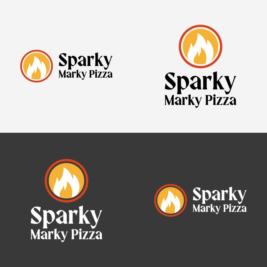
Sparky Marky Pizza
_ABSTRACT
A new concept in the pizza pickup and delivery market. Pizza with a cause (cause marketing: half the profit goes to a registered charity). Brand development included visual identity, store design, and verbal identity and advertising copy.
MISSON STATEMENT
Our passion is an expression for farming good honest ingredients. Every pizza is handmade and fire-roasted in the traditional Italian Napolean style. Our ingredients are traced back from our friends’ farms to your home.
You can feel good about supporting our mission to treat the planet and people with care and respect. Half of our profit go to charity to support girls’ education in Malawi. Wow, healthy pizza for you, and a concept that puts people and the planet first. Guilt-free never tasted so good.
Mobile prototype of concept (Work in Progress).
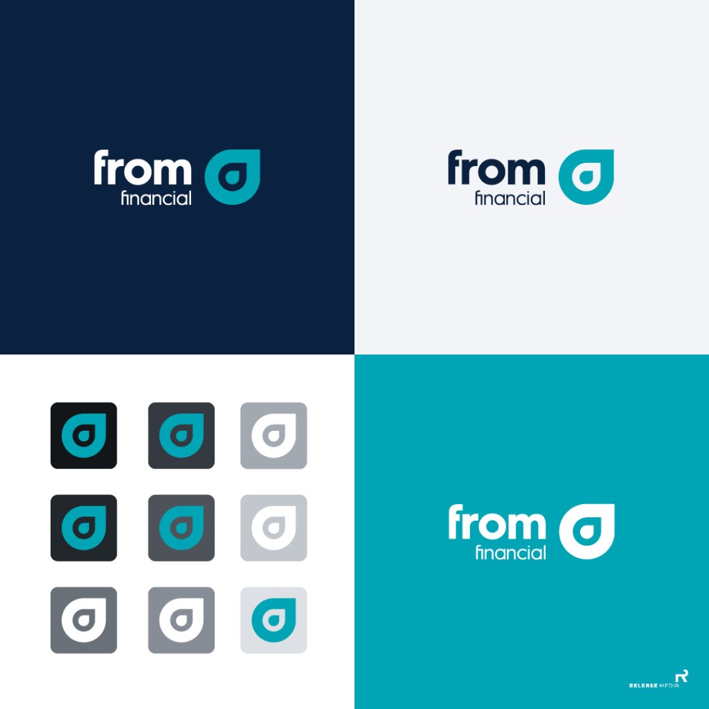
From Financial
_ABSTRACT
From Financial was looking to go beyond just another group associated with Canada Life, to a brand that put the customer at the centre of every decision they make. They needed an identity that had a precision mark and responded to all channels and media. The client also wanted a personality, and blue was an important visual attribute. The two shades of blue give a feeling of confidence and stability. The sky has never fallen; the rhythm of the ocean calms the soul.

Central dental solutions
_ABSTRACT
CDS wanted a new direction on their web site. We suggested a responsive e-commerce website but before that could happen we convinced them to spend resources on a mini brand refresh. With the web site having the potential to change the business process, it made sense to develop a brand strategy first so the visual and verbal identity were a match to their target audience. The tag line, “Helping Dental Professional Shine,” became the rally cry for all the touchpoints we created from the initial engagement.

OUTCOME
Since developing the brand strategy the Cental Dental Solutions has developed an e-commerce website based on our prototypes and wireframes. In addition, we are working together to create a suite of sell sheets to support their direct sales efforts.
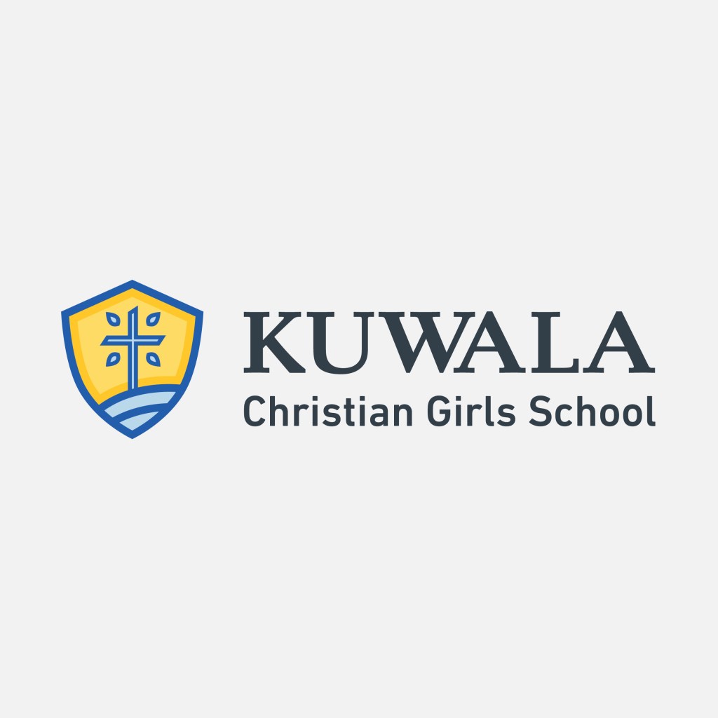
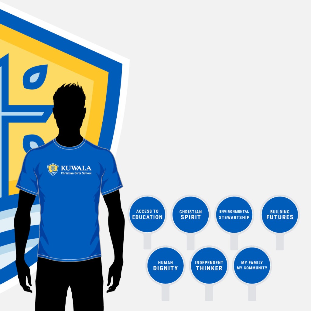
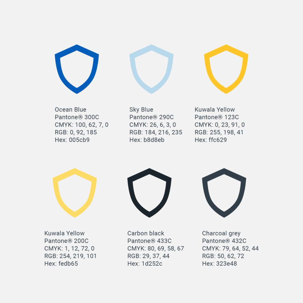
Kuwala Christian Girls School
_ABSTRACT
A new logo and brand refresh became necessary when we tested legibility concerns with the reader trying to determine what the wall of text was in the old logo. The old Kuwala logo tagline was hard to read even at 3-inches wide. Letterforms were all uppercase, making it harder to read with no advantage of a better aesthetic. Lastly, the text was not well united under different colours and weights. The new logo uses the same DNA and enhanced for digital display. The rebrand was then extended to a new website in early 2020 with more cohesive content and better accessibility.

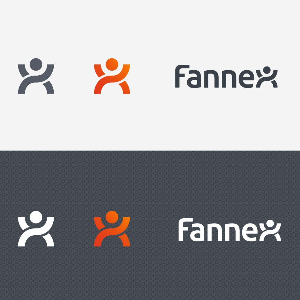
Fannex
_ABSTRACT
The brand Fannex in 2019 was at a crossroads; the digital transformation was happening across all industries, and the company needed to adapt. Fannex, seven years ago, was born as a digital-first “light-up-the-stands,” (LUTS), a mobile App version of the Bic® lighter. Even though Bic lighters go through 50 quality & safety standards, you can’t hold aflame to the potential or the safety of a retina display on a modern smartphone.
Fast forward today, we find the pace of technology has caught up to our vision of what Fannex can be. A live in-venue producer of game content can put the engagement directly in the hands of their fans. After reflecting on the success these past few years, it was time to define and develop the brand so it can compete on the world stage. Any time, anywhere. This logo is an example of a stylized wordmark that has to work hard in small sizes digitally. Each letter form is thoughtfully kerned and flows into the next form. The stylized “X” is geometrically perfect so background wallpaper could be developed as a brand digital asset.
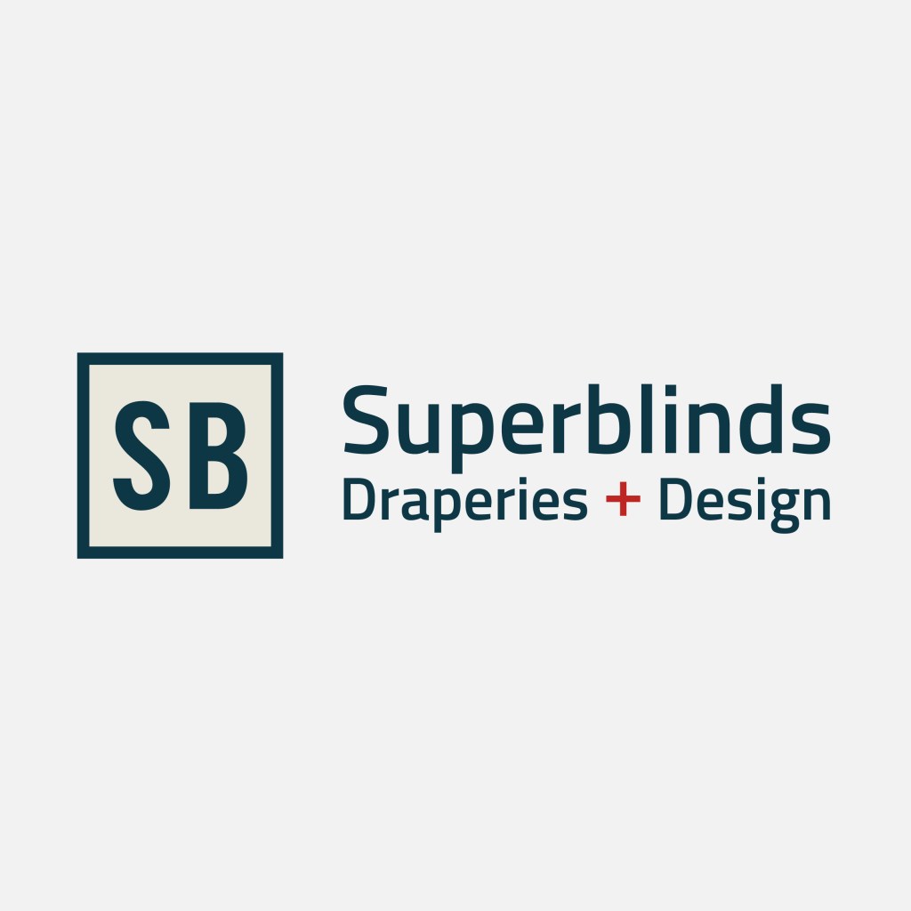
Superblinds
_ABSTRACT
Superblinds wanted a modern logo that was clean and sophisticated to replace their old brush stroke wordmark. The logo would also need to work well with the Hunter Douglas brand as manufacturer to the industry both in digital and traditional.
The logo was the start of reinvigorating the brand by developing the Design Centre around education using knowledge of interior design, technology, and imagination to enhance the sales approach. Sustainability will come from accelerated growth employing independent design consultants. They act as brand ambassadors for Superblinds & Draperies to extend the reach into the residential and commercial markets.
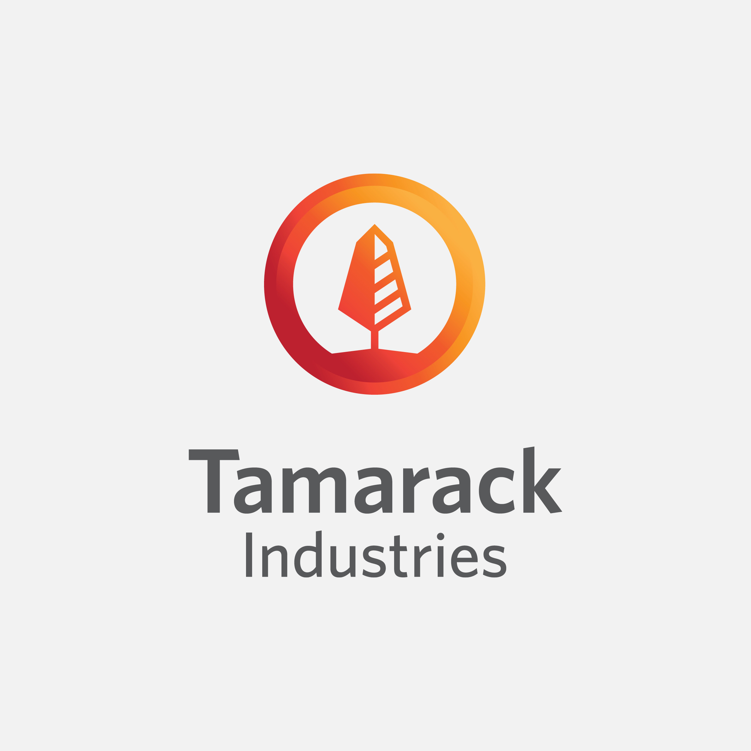
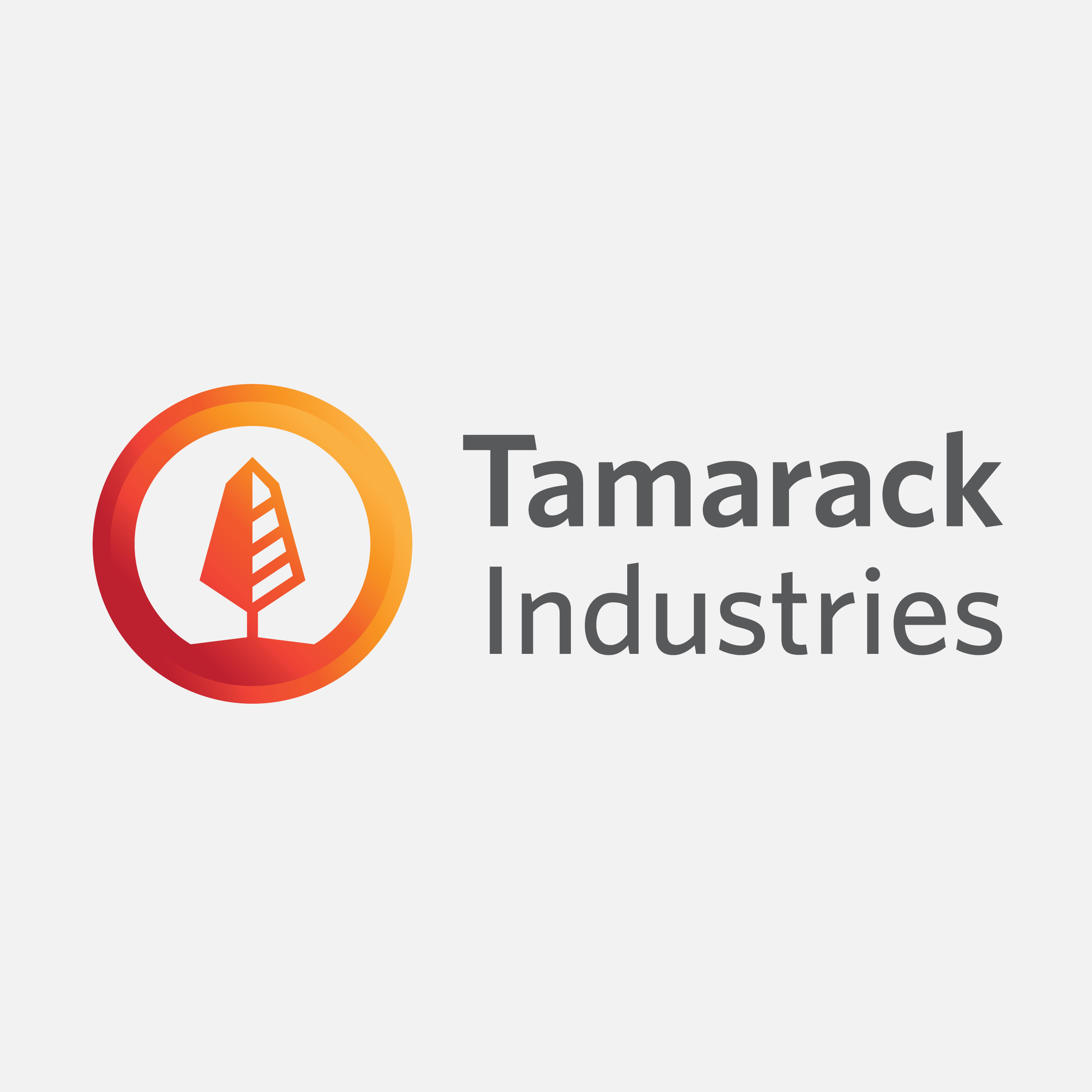
Tamarack Industries
_ABSTRACT
Tamarack Industries wanted to modernize their logo while still keeping the meaning of their brand story intact. The owner wanted a tree and a sun as symbols within the icon to signify the beginning of the company. The story is about a father and son relationship founded in the quiet moments of a sunset enjoyed at the Lake of the Woods. They both noticed at the same time, the sun on the horizon was setting and lighting up a lone tree on a rocky outcrop. This meaning of life has come full circle and is now the vision of this successful North American manufacturing company located in Winnipeg.
Caption: The typography is reflected back into this logo from the sub-brands, Heat-King, Thawzall, and Heat Assault. The fiery orange and red colours are taken from the idea of the father and son looking out on the Lake of the Woods and noticing a lone tree during a brilliant sunset in late fall. The colours are also very significant because Tamarack Industries “brings the heat” to construction sites.
Caption: The logo options include vertical and horizontal stacked versions to ensure proper logo usage when the mark needs to occupy different aspect ratios. Because of the gradient in the icon, there is a simplified version when one colour is used.
_OUTCOME
The goal was to clarify the sub-brands where owned and operated by Tamarack Industries as the parent company. Before the rebrand, there were communication gaps between the business units. This has been visually solved in corporate communication by advertising the parent company Tamarack Industries, and the sub-brands in a logo garden to show the brand relationship.
_DVH
Thawzall
_ABSTRACT
Develop a brand from an existing family of mobile flameless heater trailers for the construction trade. The idea was to design a logo with an icon and connect it visually to Tamarack Industries, the parent company. The client had an existing logo they didn’t like but wanted to convey the idea of heat without using a stylized flame. The “heat camo,” is used as a graphic element to portray heat without the common visual metaphor of using a flame.
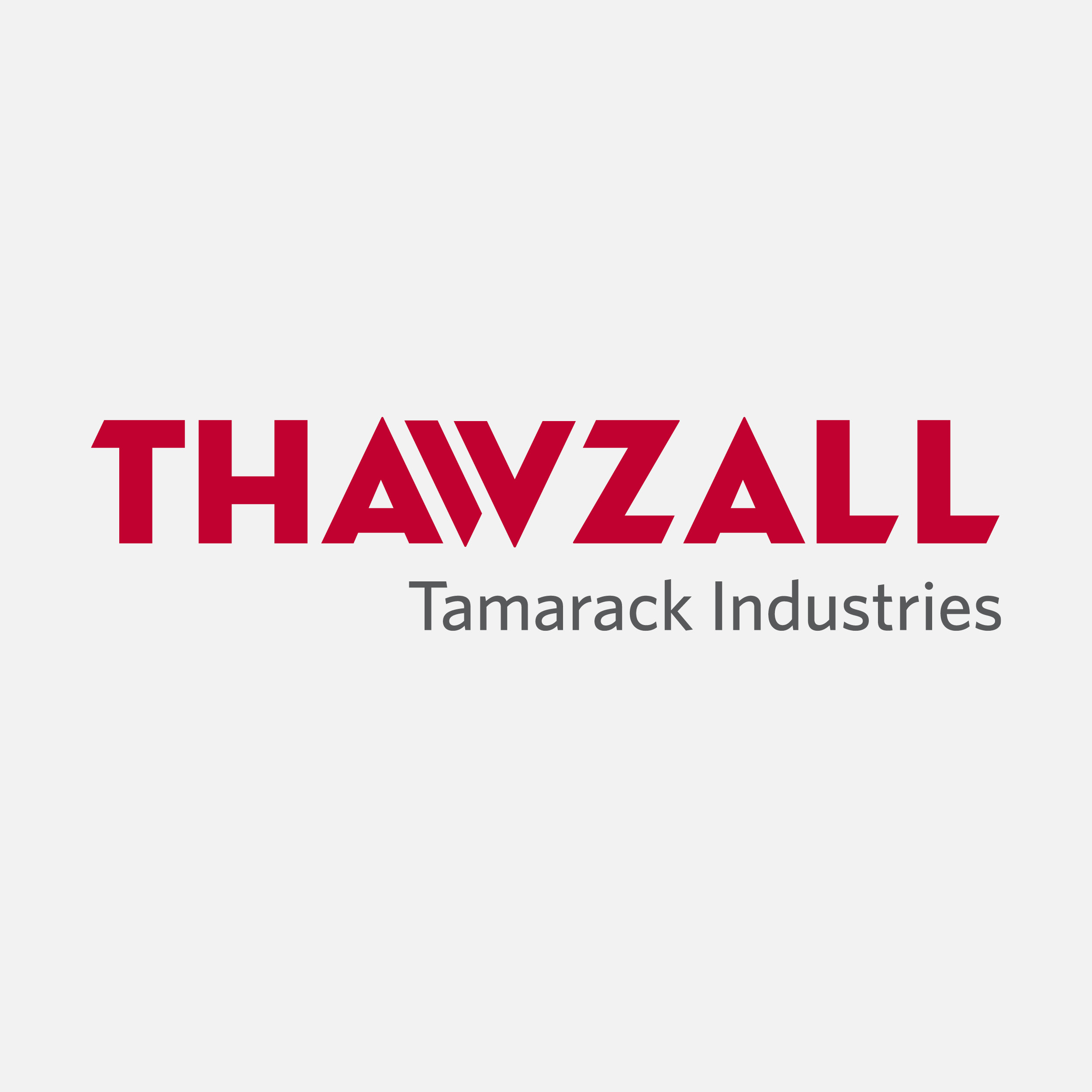
Caption: The typography is a custom typeface created specifically for Tamarack Industries used for Thawzall and in the future, all sub-brands.

Caption: The old Thawzall brand used flames and gradients to signify the generation of heat. The challenge was to create this idea of indirect heat because the product uses a flameless heat technology. The pattern called, “Heat Camo” came from the inspiration of looking into hot coals. The glowing embers pulse and glow.
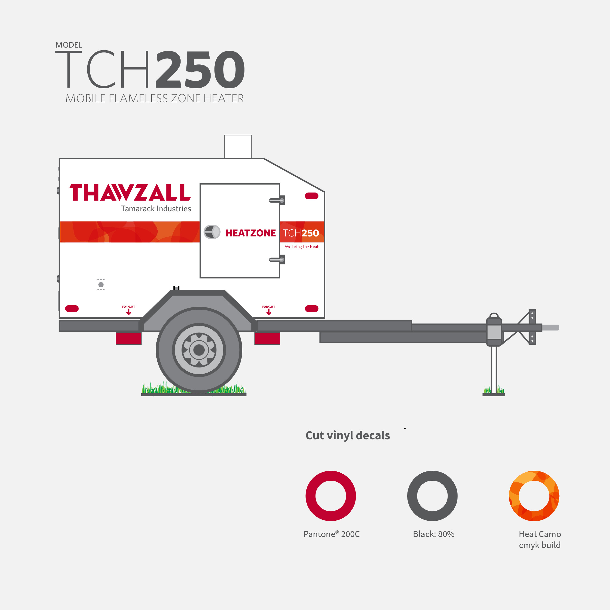
Caption: To capture the brand’s essence and some of the graphic elements, a mockup of a Thawzall TCH250 flameless zone heater was illustrated. It shows the placement of graphics for simplified alignment around the heater’s components. As a result of the redesign, there are reduced costs in production and labour. The decal design now mirrors the quality of this heavy-duty design.
U-Turn Parkinson’s
_ABSTRACT
The name is taken from the founder [MR. TIM HAGUE, SR] and his son’s experience in winning The Amazing Race Canada. During the show, competitors are given the opportunity to U-turn other racers with the intent of either slowing them down or eliminating them from the race. At U-Turn Parkinson’s they desire to slow the disease and not let it define a life.
Brand Strategy is the foundation upon which U-Turn Parkinson’s was built. It informs and guides the brand every step of the way. It defines who they are, who their customers are, and how they can differentiate us from other non-profit organizations.
The brand crafted the strategy based on knowledge and insight gained from within the organization and the diverse business backgrounds of the founding stakeholders. Capturing who they are and the vision of what they want to be, the strategy guides them along the journey to an inspired future to build the U-Turn Parkinson’s non-profit organization. Getting to know Tim, I realized he is active and was looking for a brand that spoke to his audience but was seen as an energetic brand. It’s all about living in a state of wellness: intellectually, occupationally, spiritually, physically, socially, and emotionally.
Caption: a vertically stacked version of the logo shown in reverse
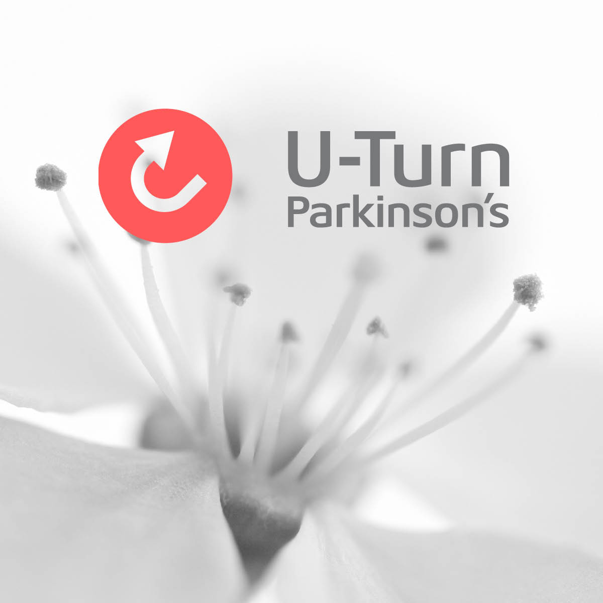
Caption: a horizontal version of the logo shown in full colour
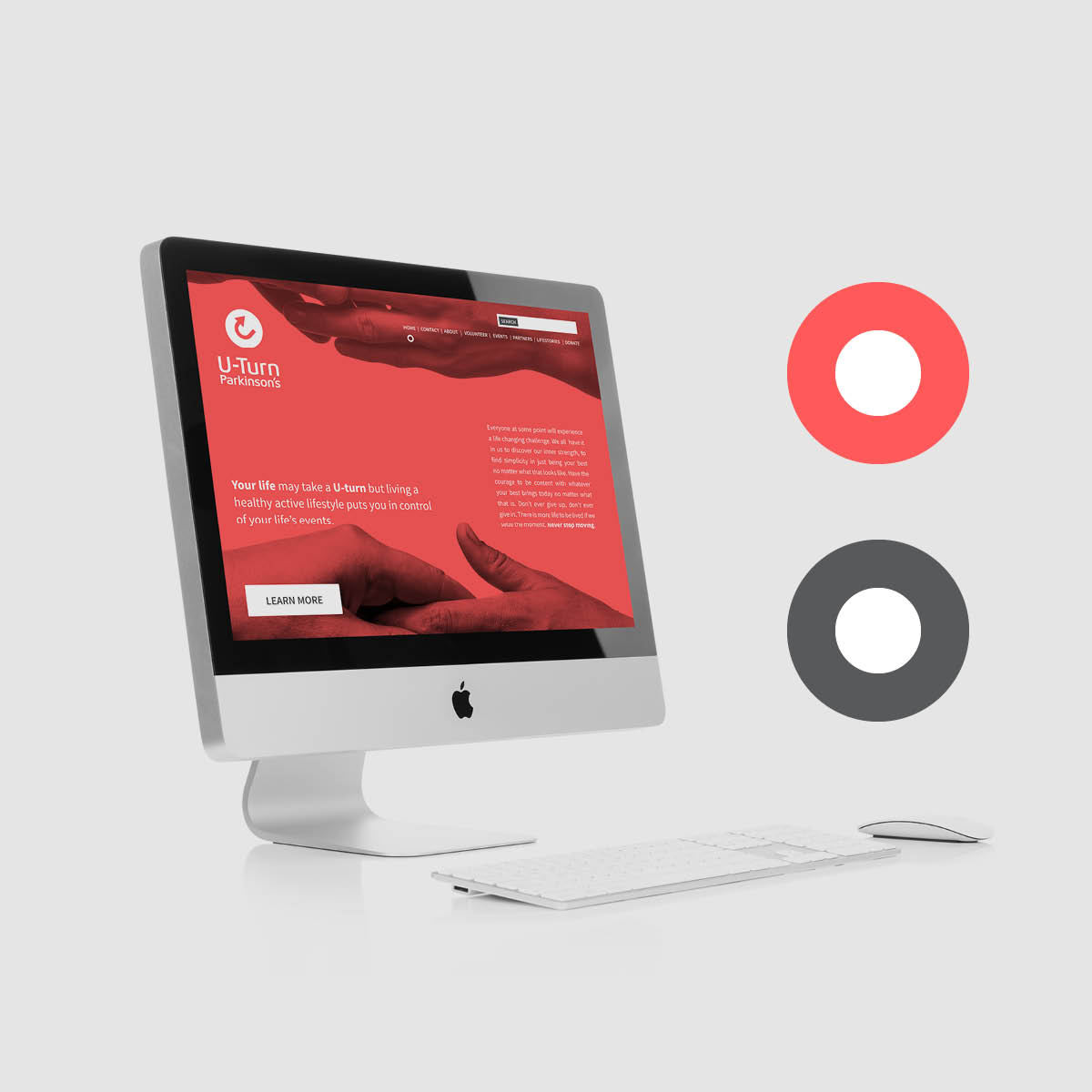
Caption: website user experience and colour pathway
_OUTCOME
Over a 6 month period, I worked with Tim Hague to produce all the brand elements including: visual identity, personas, photography style, voice & tone, messaging, social media strategy, and promotion. The brand strategy guideline contained all the necessary elements to activate the brand across all audience touch points.
Ultimately what I enjoyed about the project was how committed Tim was to supporting individuals impacted by Parkinson’s through a holistic approach to wellness. He believes health is an active process through which people become aware of, and make choices toward, a more successful existence. Great words to live by.
_DVH
Varafit
_ABSTRACT
The brand was developed to encourage a healthy lifestyle that is reflective of the quality of sleep you get. The Varafit name’s inspiration came from the spirit of yoga where inner peace is balanced with an active lifestyle. The product assortment selection of the program extended to three different comfort levels of soft, medium, and firm mattresses and pillows designed to fit the curvature of spine and neck.
The brand strategy was to create an in-store experience and a consultative sales approach where the correct fit is more important than price. We spend 1/3 of our life in bed, the cost of a mattress and pillow is an investment in maintaining a healthy lifestyle.
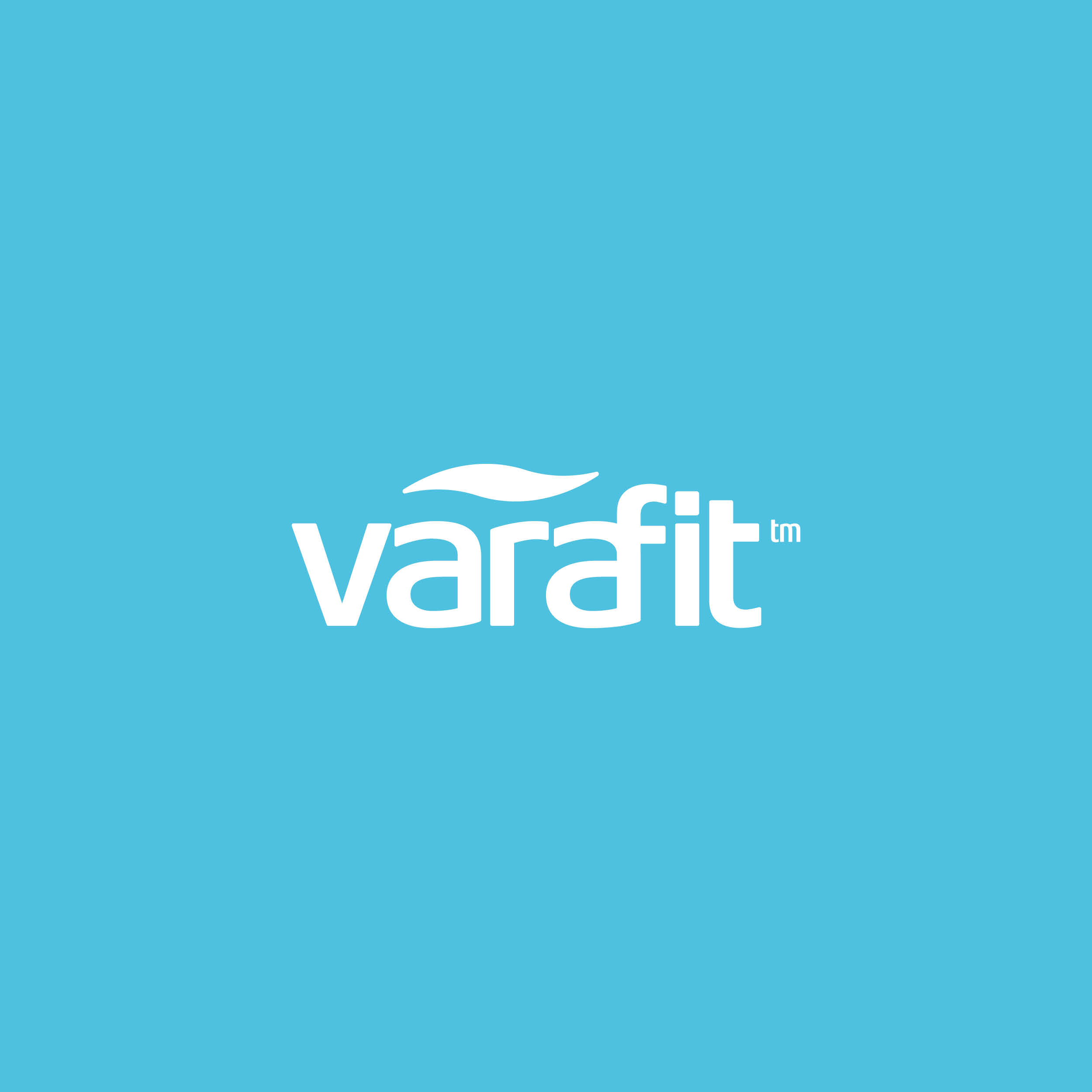 Caption: horizontal version of the logo shown in reverse
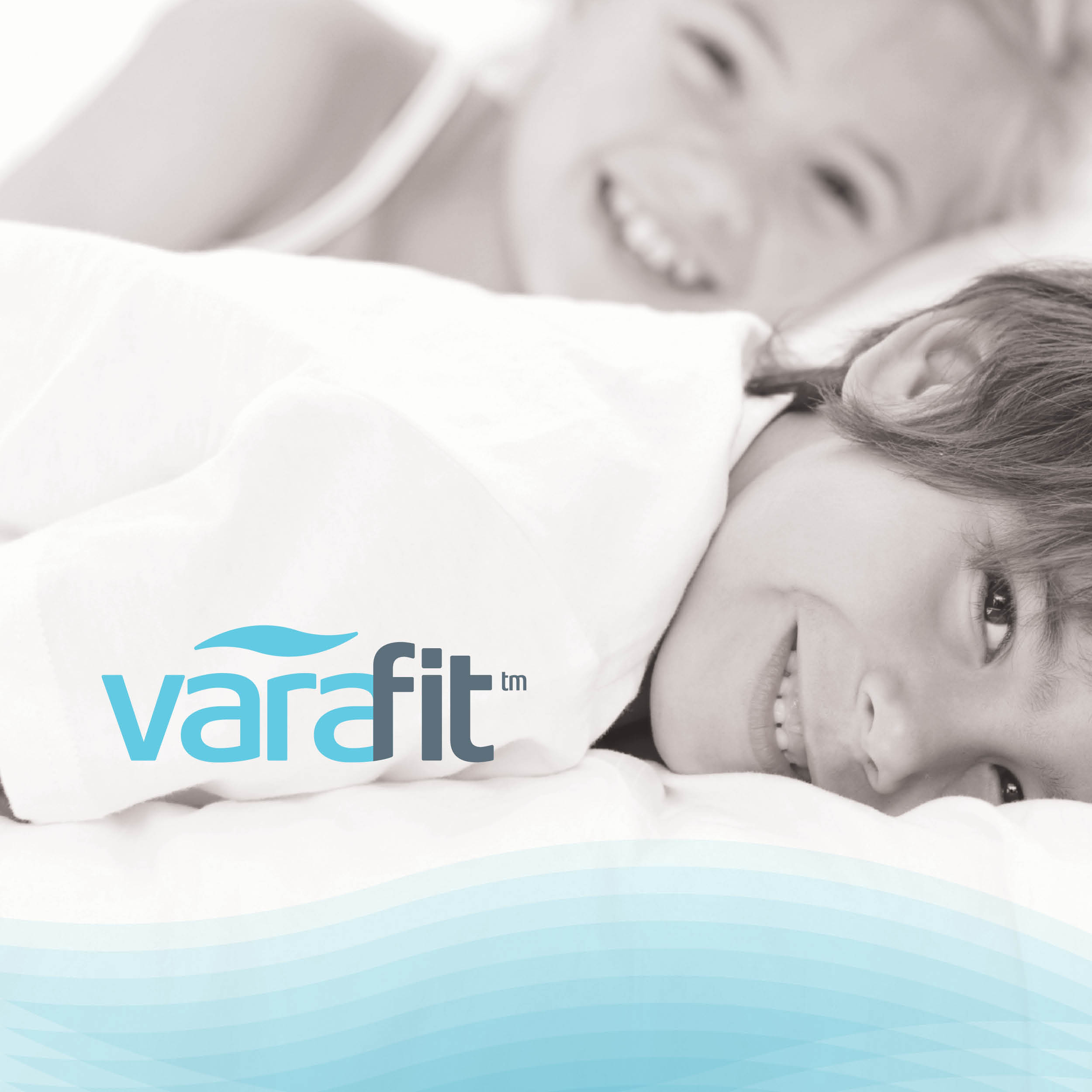
Caption: a horizontal version of the logo shown in colour with photography style.
_OUTCOME
The product launch at Dufresne stories introduced the Dream Experience in-store sleep centre. As part of the brand, a new consultative sales approach and pressure mapping technology were developed to help customers find the perfect fit. Instrumental in the store design was environmental signage, a branded experience, and education developed in partnership with Kim Jeremic, a retail store design consultant.
The result was dramatic. A 30% increase in sales in the first six months, increased margin dollars per product, and a 100% increase in pillows: the result of a systematic sales approach.
_DVH
